The New Look of HARDWARE.co
|
The HARDWARE.co Team has big plans for 2015 – and this website is only the beginning.
As you may have noticed from our Facebook page, Twitter feed, Meetup or newsletter – we have made the leap to update the look of the HARDWARE.co brand with the help of some incredible designers. In just a few months – and after a number of painful lessons in CMYK to RGB color conversion – we are excited to share with you the 2015 reworking of the visual design for HARDWARE.co. The new logos, icons and color scheme were selected with the creative direction and designs of Ben Mansell of Elselab, all the way from Seattle, Washington.
As anyone who has dealt with branding can tell you; the design of your logo, the color scheme of your company visuals and design of your website is no small undertaking. When we first approached the redesign the HARDWARE.co team was torn over how far to push the updates while still conveying what we love about HARDWARE.co.
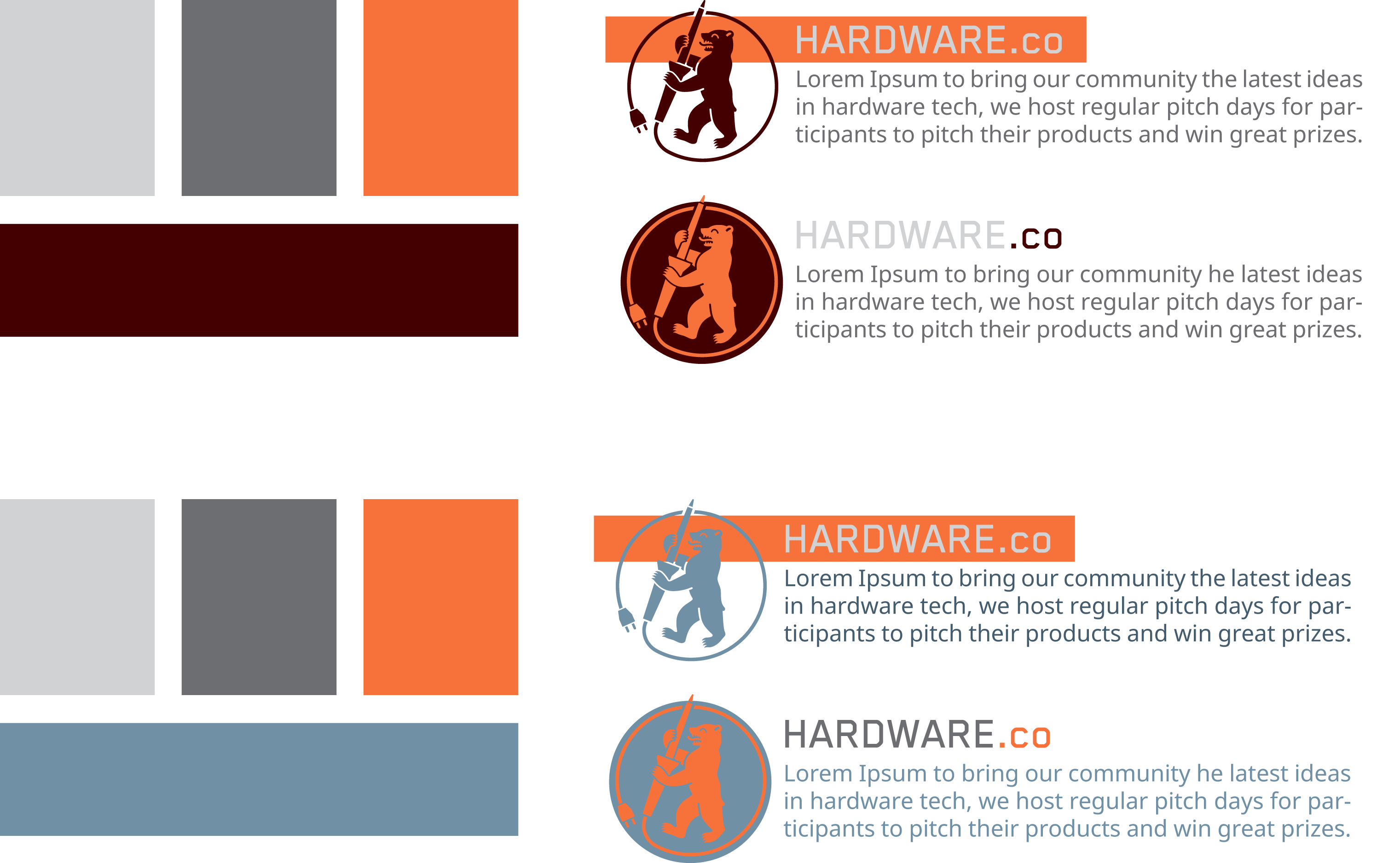
Early attempts to find a new color scheme by the HARDWARE.co team
With insight from the expert (i.e. Ben), we decided to leave the electric green and navy blue color scheme behind in favor of a warm copper. The copper-orange references the copper leads found in most electronic components. The copper industry’s most important market is electrical wiring and is used in nearly all electronic application and is present in nearly all newer integrated circuits and printed circuit boards, conducting better than aluminum and other metals. Accompanying our orange is a color palate including two grey tones and a navy blue to give some visual depth to our printed and online materials.
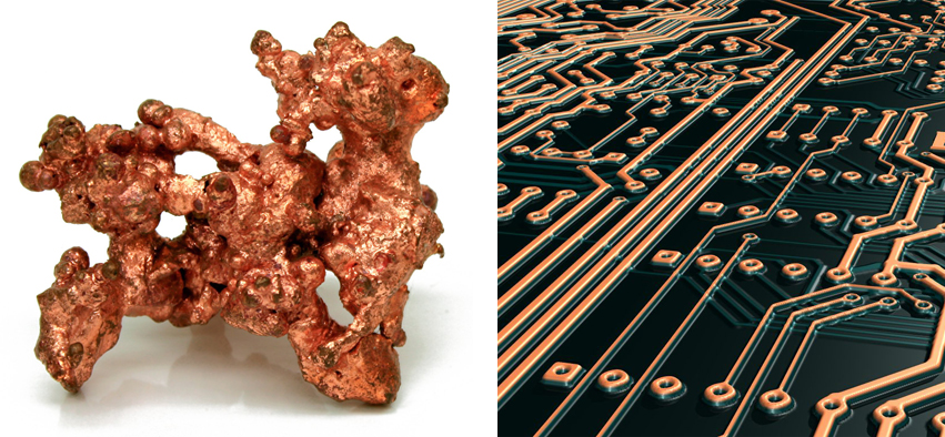
source: circuitboard.com/wp-content/uploads/2013/07/pcb3.jpg and wikimedia.org/wikipedia/commons/f/f0/NatCopper.jpg
Perhaps the hardest decision we made was the redesign of our beloved Berlin soldering bear – the central visual component of most of our press material since HARDWARE.co’s beginning in 2013. We decided to shift focus to an icon that would better represent our rapidly growing national and international community and opted for a H.co icon to represent equally the cities of Munich, Berlin and wherever we expand next. For those of you who remain steadfast fans of the soldering bear, Ben designed for us an update of the classic round icon – just in case we decide to use him in the future for our HARDWARE.co Berlin. Ben stated that the plan for the new Bear, eventual Monk and other city marks was to use them “independently and alongside the more global H.CO mark. It’s a fun way to keep developing the local (city) H.CO brand while keeping some consistency.”

Left to Right: The original soldering bear and the updated illustration for 2015
Thanks again to Ben for all of his amazing work. Adding to the international design team we employed, we owe thanks to the Berlin-based web development agency bleech took over to design the front end of our brand new website. Last, but certainly not least, a huge debt of gratitude to Jonathan Mullins for being our fearless developer for the project.